High-performance websites: How to achieve the best possible interaction
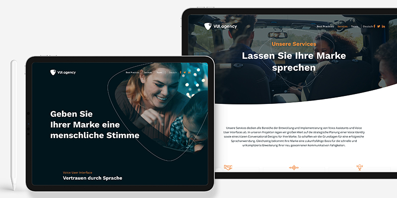
The corporate website is almost like the figurehead of your company. Nevertheless, many managers often pay too little attention to this aspect. With just a few steps, it is easy to design the website in such a way that it effectively appeals to potential customers and wins them over. You can read here which visual aspects are in the foreground.
The first visit to a company website is similar to a visit to a retail store. It is the very first seconds that decide whether or not the potential customer crosses the threshold of the store. The aim here is above all to win the customer as a paying customer and to ensure that he or she comes back. A similar situation can also occur on a company’s website. Here, too, the aim is to impress the user, to address him in the right way. Especially on the “digital business card” of the company, where the first impression is so important, the implementation often fails. The customer journey leads nowhere or the visual appearance is not appealing enough for the user. In the expectation of captivating website visitors on their own company website and motivating them to convert, many decision makers forget essential aspects that are crucial for the success of a web presence. We have summarized the most important rules for you.

According to specialist Contentsquare, more than two thirds of all web content passes unnoticed by visitors. Why?
Just like the sales staff when entering a store, the company has to convince its regular or potential new customers of itself first – this starts with the visual appearance of the website. It must perform optimally and present itself from its best side. For Evernine, three page types are crucial for the success of the website and thus also of the company: the home page, the product pages and the about page.
Here you can learn more about the most important features of well performing websites.
1. The homepage – the very first impression
You know it yourself: If the website loads slowly and hangs up, this leads to disappointment and you leave the website immediately. The consequence is high bounce rates, which also have an influence on the ranking of your site on the net. On average, these are between 40-60% for corporate websites (source CXL). If the website loads quickly, this increases the length of stay and also the chance of conversion.
Often, visitors to a website only give a single chance. This is often due to the design and basic presentation of the website. In the form of a modern “OnePager” you can pick up your target group early and navigate directly to your central topics without further ado. Furthermore, the “OnePager” literally screams for the integration of trust elements: Customer references, certificates and awards are particularly trust-building and should not be withheld from potential new customers under any circumstances. Once this trust is established, the customer knows you a little better and should be ready to take the next step with you.

2. The product page – arouse & maintain interest
The elements and themes promised on the start page must be reflected accordingly on the product pages – don’t let up! The interest must be maintained. Ideally, this is done by introducing the visitor emotionally to the “product storytelling”. Here, the visitor’s involvement is activated in particular through visual features and an appealing header image. In the next step, product specifications can be shown. Conciseness and clarity have the highest priority. Put yourself in the perspective of a new customer and work best with sound Pain Points, which pick up the customer immediately at the right place. This way the customer feels understood and gives you greater confidence. The presentation of the products therefore goes hand in hand with the delivery model you have designed.
But the customer journey does not end here. The goal is to convince the potential customer to the extent that he reacts to the call to action (CTA). CTA buttons can contain a wide variety of functions:
- Increase curiosity,
- Get in contact,
- Order services.

But no matter what function the button fulfils, it is essential that it is optimally embedded on the website (neither too subtle nor too obtrusive) and ultimately encourages the visitor to convert.
3. Die About-Seite – Persönlichkeit & Charakterstärke
A page that is often neglected, but in reality is the most visited page type: The about or about-us page that puts the company in the spotlight. If we make the parallel to the shop visit again, this sub-page can be equated with the personality & brand staging. Potential new customers are not only interested in the external appearance, but also in what (and also who) is behind it.
Here you may and should present your company including its philosophy, vision & milestones (USPs). This is a sign of honesty and shows that people are behind the products. The actual team, along with other trust elements, must not be neglected either. Because the team functions in the eyes of the visitor like a personality indicator and can be placed on this page as well as Founder & CEO.
If you take these key data and elementary features to heart, nothing should go wrong with the first contact with a potential new customer – it might even become a long-term business relationship.

If you want to take your business to the next level, webinars from a communications consultancy such as Evernine Group can help you. On 21st august 2020, CEO Alexander Roth & web specialist Alec Chizhik will give exciting insights for high-performance websites.
Source Cover: Evernine.


