Which optical design trends will influence digital marketing in 2023
In digital marketing, design is increasingly changing. There is reduction, there is departure, fantasy stimulation and dramatic contrasts. For those who want to delve a little deeper into the topic, the creative unit of the Munich-based full-service agency Evernine Group presents the most important trends for 2023.
Maybe it’s the crises of the world, maybe it’s the fact that new ideals are emerging, that we have new moral and responsibility trends. So the optics in brand communication are also changing. The Munich-based communications consultancy with an affiliated full-service agency, Evernine Group, has taken a close look at current trends in design and compiled them by its creative unit. They show a differentiated picture of how current design is changing in terms of thrust. Evernine has deep insight here as a communications consultancy with an affiliated full-service agency. As part of larger brand and GoToMarket projects with market expertise, consulting and technical implementation, the company accompanies customers in particular in the redesign of brands with a digital focus.
#1 Anti-Branding
The design trend “anti-branding” describes an approach to design in which traditional branding, i.e. the conscious creation and marketing of a brand, is deliberately avoided. Instead, anti-branding designs use elements that are deliberately unconventional or barely visible in order to attract the attention of the target group. The focus is less on the brand itself and more on the design of the products or services. The trend is characterized by minimalist messages or monochrome design.
Many brands are already relying on this trend, even if it may sound supposedly striking. The reason is quite simple: demonstration of authenticity and recognizability. Emerging, minimalist, and forward-thinking anti-branding is closely related to the “new eco” trend that will dominate branding in 2023. The “eco” trend in design refers to a move toward environmentally friendly and sustainable designs. This involves choosing materials and manufacturing processes that minimize environmental impact.
Barely visible branding, monochrome packaging and minimalist messaging are the biggest features of the anti-branding trend: it’s stripped-back, encompassing everything from neutral, embossed logos to handwriting and imprecise typography. In design, anti-branding is used to give content a human expression.
More and more brands are opting for a simple design – whether in the form of handwritten typography or a reduced color scheme. Meanwhile, some companies are even doing away with recognizable branding altogether. The “anti-branding” trend is particularly well suited to brands that want to appear straightforward and whose products, for example, are made with passion by human hands.
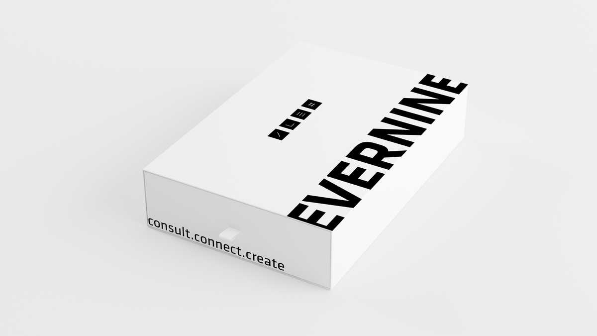
Despite the simplicity of this design style, it can make a big impact. The simple black text in combination with the clean white background immediately conveys the information that the consumer needs – without distracting design embellishments.

The design trend of “anti-branding” stands for barely visible branding – it is characterized, among other things, by minimalist messages or monochrome design, as in this example. Image: Evernine Group.

Vibrant minimalism is defined by simple visual elements complemented with intense and bold colors. Image: Evernine Group.
#2 Vibrant minimalism
The design trend ” Vibrant Minimalism” combines minimalist design aesthetics with elements of nature and organic forms. It combines minimalist design principles such as simplicity, clean lines and reduction with organic shapes, soft textures and colors from nature. The goal is to create a calming, natural atmosphere that gives the user a sense of peace and relaxation. Vibrant minimalism is often associated with Scandinavian design and is a reaction to the overconsumption and overproduction in our society.
In 2022, vibrant minimalism was most popular in product packaging, but this year the trend is now reaching other areas of design. The style of vivid minimalism is characterized by simple design elements in combination with bright, bold colors, creating a balance between restraint and playfulness.
When minimalist design is used in a lively way, it adds playful energy to projects without sacrificing a straightforward design approach. This trend combines opposites – minimalism and maximalism. This allows designs to stand out while maintaining their own sophistication. Overall, this trend is about combining minimalist design with a touch of naturalness and warmth to create a harmonious balance.
#3 Abstract gradients
The design trend “abstract color gradients” describes the use of color gradients that do not represent concrete shapes or objects, but appear abstract and flowing. The color gradients can be used as backgrounds for various designs, such as logos, websites or graphics. The trend is particularly popular with younger target groups and reflects the need for individuality and creativity.
Gradients are universal, visually appealing and allow designers to easily and effectively add color and texture to any design. Abstract gradients create a modern and dynamic aesthetic that is visually appealing and flexible. The flowing gradients create a sense of vibrancy and movement that allows companies to express their brand personality in a creative and unique way. The trend also reflects the need of target audiences for a visual experience that is both engaging and original.
“Abstract color gradients offer an opportunity for businesses to visually differentiate themselves and express their uniqueness. This trend has the ability to create a dynamic and engaging aesthetic that can appeal to different audiences,” confirms Charlotte von Braunbehrens, CHRO and senior communications manager at Evernine Group.

Charlotte von Braunbehrens, CHRO and Senior Communications Manager at Evernine Group, Image: Evernine Group.
#4 Retro Line Art
The design trend “Retro Line Art” describes an aesthetic inspired by nostalgic designs from the 1950s to 1980s. The design uses clean lines and minimalist shapes, often complemented by a limited color palette. The trend is particularly popular with younger target groups and conveys a sense of nostalgia and the past.
In 2023, many designers are focusing on minimalist line art because this style lends itself well to creating amusing and cheerful illustrations. The line art trend’s simplicity makes it ideal for cartoon-like styles (such as thick outlines and rubber pants limbs, where cartoon characters are made of curved, almost rubbery, lines), so the trend naturally suits more “light-hearted” and casual projects. The minimalist drawings create the advantage of being able to use ultra-bright colors without crowding the viewer. Many designers combine these illustrations with bubble fonts and design features to enhance the retro effect. This look is often reminiscent of old magazine advertisements, such as oval borders or star-shaped stickers.
The goal of “Retro Line Art” is to create a nostalgic aesthetic that references the past while still looking modern and current. The trend uses minimalist shapes and clean lines to create a simple, yet appealing visual experience. The goal is to convey a sense of familiarity and nostalgia while maintaining a modern and contemporary design. This can significantly reduce the emotional distance between users and the company. Corporate values and brand messages can be communicated much more easily, building trust and strengthening loyalty. In addition, hand-drawn illustrations can offer strong added value in terms of recognition and identification.
#5 Overlapping web design elements
“Overlapping web design elements” use overlapping elements in web designs to create a three-dimensional and spatial feel. This trend often uses layers of text, images, graphics, and other elements to add visual interest and a deeper level of detail.
Web designs have long been tied to grids, where layouts were arranged in structured, uniform spaces and everything was in the supposedly right place. The trend of modern web designs is to move away from this boxed model and toward web design elements that overlap – creatively and functionally.

In 2023, deliberately placed overlaps are often seen in the layout. They add multidimensionality to a simple image and text composition in a simple way. Image: Evernine Group.
Well-known websites of large companies are increasingly starting to overlap their page elements, sometimes overlaying images with text to such an extent that they are barely recognizable. Often these pages rely on a fundamentally appealing sense of form and only certain headline texts overlap, creating a slightly brutalist effect.
That’s exactly what makes this trend so attractive to the masses: It blasts uniformity without the entire page slipping into empirical chaos. The end result not only clarifies connections through the overlaps. It results in a cross-element and cross-section user experience. The brand image can be conveyed more harmoniously and in a modern, lively way.
Essentially, this trend is a reference to the fact that breaking rules is becoming more and more acceptable, as most people seem to be more than bored with the same neatly structured layouts over and over again.
Ultimately, how these trends are used can leave a lasting impression. “Companies should look at trends based on how appropriately it integrates with their chosen corporate design. Fundamentally, these trends can help companies improve visual perception and user experience. By implementing new and innovative design concepts, they can strengthen their image and expand their audience,” said Charlotte von Braunbehrens, CHRO and senior communications manager at Evernine Group.
Source title image: Evernine Group
The “Retro Line Art” design uses clean lines and minimalist shapes, often complemented by a limited color palette.


