

These are the colour trends for 2021 in B2B & B2C marketing
Colours, shapes, gradients – colour development in branding must not be forgotten, especially when it comes to addressing customers. The design of websites, logos and the like is constantly being interspersed with new visual ideas. But also well-known design trends are finding their way back into modern design and are really coming to life again. Colour gradients are also celebrating their comeback for your marketing in B2B and B2C. In this article, we show you the trends of 2021, what role colours play in social media and give impulses on how you can further develop your current colours.
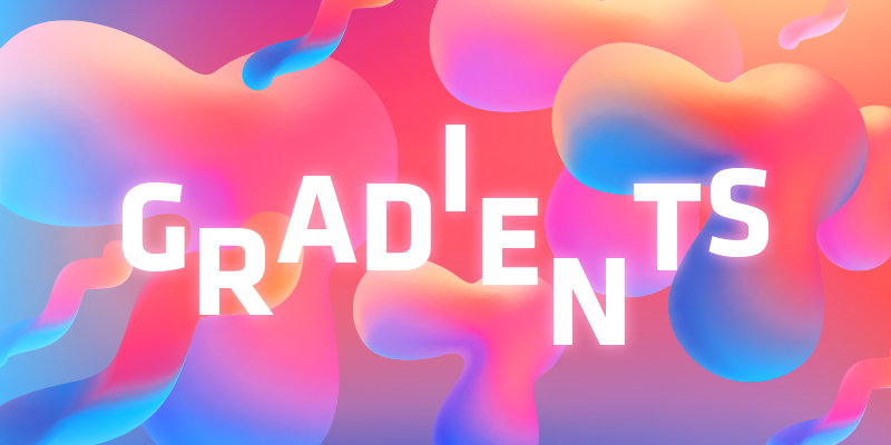
As the year 2019 is slowly coming to an end, let’s take a look at the design trend in 2020 – colour gradients.
What are gradients?
Gradients connect colors with each other. Two similar colour shades, for example light and dark, can run into each other, as well as one colour into the next or from the next to the next but one. Gradients are therefore very versatile. Talk to your graphics department to see if your corporate design can also develop in this direction. Because colour gradients are on the rise and are used more and more often.

Verlauf ähnlicher Farbnuancen

Verlauf zweier unterschiedlicher Farben

Verlauf mehrerer Farben
“Color does not add pleasant quality to design – it reinforces it.”
– Pierre Bonnard
Especially in the B2B environment, color gradients will play an increasingly important role. But why are color gradients so popular? Colour gradients make design stand out! They are eye-catching and breathtaking. Especially with regard to the trend of flat design, where design is flat and monochrome, colour gradients stand out clearly. They make the design tangible and vivid for the viewer, give websites and logos a three-dimensional look and pick up the probably biggest design trend ever: Colour!
We are confronted with a multitude of content every day, making it difficult for companies to stand out from the crowd at first glance. Colour gradients are the optimal means to attract attention.
Right now it is important to jump on the bandwagon to stand out from your competitors who have chosen the light and soft shades of the last years.
Colour gradients in logo design
Large companies, such as Instagram, are setting a good example. Colour gradients have become increasingly established in the B2C environment and have become a popular design element for designers. Among other things, this is also due to the ever improving interpretation by web browsers. But also for companies in the B2B sector, specifically used gradients are becoming more and more an issue. Colour gradients make the logo, as the face of the brand, appear more dynamic and convey an unmistakable appearance. There are of course no basic rules for the use of colour gradients for companies. However, it is important to use gradients purposefully and carefully so as not to overwhelm the viewer. Stronger colours and complementary colours make the logo appear striking and self-confident, whereas soft and restrained colour gradients have a simple effect.
The pioneer Instagram, the company NineBrackets and Sky are good examples of how gradients can be used in logo design.
Colour in Webdesign
In the design of websites, too, there are many possibilities to use colour gradients and thus to convince visually, which is why the trend is also finding its way into the B2B environment. Large as well as small colour gradients can draw the user’s attention to important elements, make images look more lively with an overlay or create accents. Even monochrome monotone backgrounds are given a new dimension by a gradient. It is advisable to focus on contrasts, for example between white areas and elements with a gradient, in order to make them stand out. Gradients are also the perfect means of directing the viewer’s gaze for call-to-actions.
“Digital design is like painting, except the paint never dries.”
– Neville Brody
Companies like Raidboxes and Instagram are showing the way. And especially internationally, color gradients are already firmly established in digital business, as the example Stop the dot shows.


Quelle: Instagram Brand Resources
Compared to other design elements of earlier decades, colour gradients will certainly remain in vogue for some time to come and can be used as a visual element in the long term.
So in the future we can look forward to websites and logos having more colour and dimension. Especially the further development of compatibility through web browsers makes the colour gradients more and more exciting and promising.
The more innovative innovations, such as virtual reality or artificial intelligence, find their way into the B2B environment, the more important it is to make these progressive changes tangible and visually present them through web and corporate design trends. Last but not least, the digital appearances of companies have been increasingly enriched by these advances, for example through animation or interaction. The trends for the coming year bring both together – innovation and design. Picking up on current design trends makes companies look modern and contemporary year after year. As the year slowly draws to a close, it is already time to think about the future visual development of companies.
Source cover photo: Evernine