


From vibrant minimalism to anti-branding, these are the hottest design trends of 2023
We live in a world that is constantly changing. And that’s exactly what’s happening in design. The further away the pandemic seems, the more innovative approaches to digital design, branding and print are emerging, giving us a vague glimpse of the future.
In 2023, the same applies: New year – new trends! We have summarized the most exciting of these trends for you.
#1 Anti-branding
Many brands rely on this trend, even if it may sound supposedly striking. The reason is quite simple: demonstration of authenticity and recognizability. Emerging, minimalist and forward-looking anti-branding is closely related to the “new eco” trend that will dominate branding in 2023.
Barely visible branding, monochromatic packaging and minimalist messaging are the biggest features of the anti-branding trend; it’s a stripped-back approach that encompasses everything from neutral, embossed logos to handwriting and imprecise typography. In design, anti-branding is used to give content a human expression.
More and more brands are choosing a simple design – whether in the form of handwritten typography or a reduced color scheme. Meanwhile, some companies are even dispensing with recognizable branding altogether. The “anti-branding” trend is particularly well suited to brands that want to appear straightforward and whose products, for example, are made with passion by human hands.
Despite the simplicity of this design style, it can make a big impact. The simple black text in combination with the clean white background immediately conveys the information that the consumer needs – without distracting design embellishments.
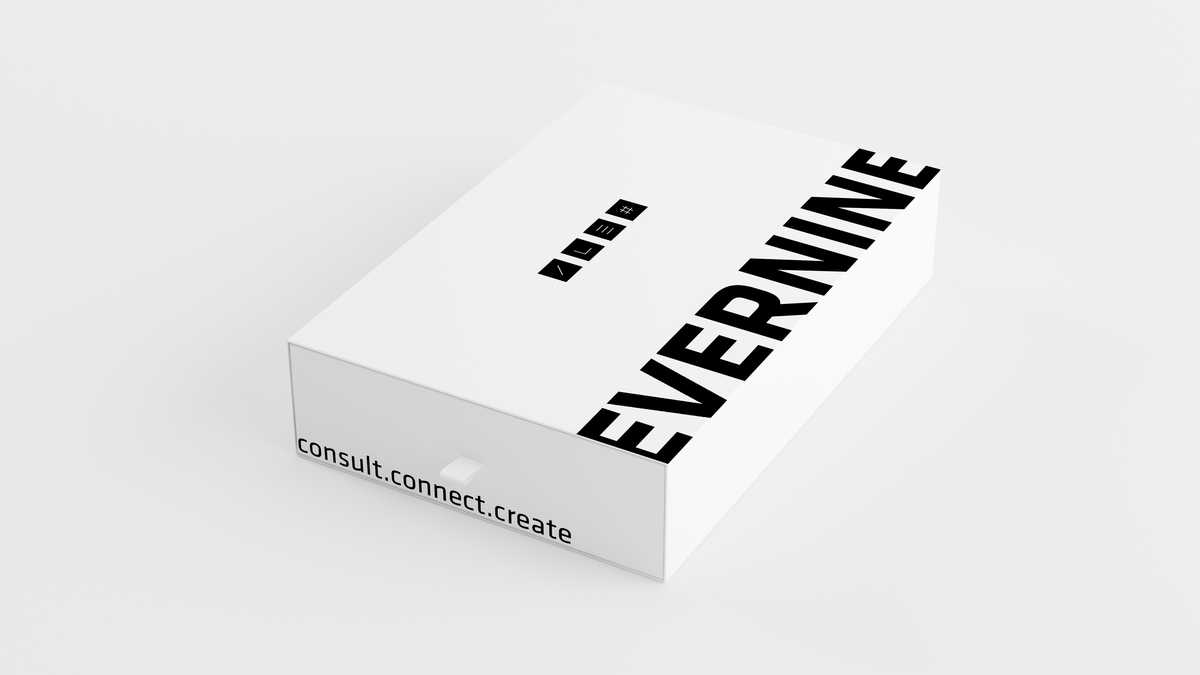
The design trend of “anti-branding” stands for barely visible branding – it is characterized by minimalist messages or monochromatic design, as in this example. Image: Evernine Group.

Vibrant minimalism is defined by simple visual elements complemented with intense and bold colors. Image: Evernine Group.
#2 Vibrant minimalism
In 2022, vibrant minimalism was most popular in product packaging, but this year the trend is now reaching other parts of design. The style of vibrant minimalism is characterized by simple design elements in combination with bright, bold colors, creating a balance between restraint and playfulness.
If minimalist design is used in a vibrant way, it adds playful energy to projects without sacrificing a straight-line design approach. This trend combines opposites – minimalism and maximalism. This allows designs to stand out while maintaining their own sophistication.
#3 Abstract gradients
Gradients are universal, visually appealing and allow a designer to easily and effectively add color and texture to any design. They’ve been trending for a while now and manage to excite and captivate us every time. Gradients in 2023 are no exception: this time they come as abstract shapes and blur into blurs.
Gradients are not what they used to be. They have evolved greatly, inspiring the creative community to exciting explorations and experiments with multicolor gradients.
The organic shapes of abstract gradients, together with their lively coloring, create a feeling of weightlessness and lightheartedness. The misty edges add a touch of realism, as if these gradients consisted of blown multicolored sand. Due to their soft coloring, gradients have an inherently calming effect, and the flow of abstract gradients enhances this effect.

Gradients can do more than just linearly fill in backgrounds – as in this example, gradients will be used in even more creative ways in 2023. Image: Evernine Group.
#4 Retro Line Art
In 2023, many designers focus on minimalist line art. This is a retro style that takes us back to the time when we painted life more colorful with felt pens. This style is perfect for creating amusing and cheerful illustrations.
As a result, the simplicity of the lineart trend makes it ideal for cartoon-like styles (such as thick outlines and rubber hose animation, where cartoon characters are made of curved, almost rubbery, lines), so the trend naturally suits more lighthearted and casual projects. The minimalist drawings create the advantage of using ultra-bright colors without crowding the viewers. Many designers combine these illustrations with bubble fonts and design features to enhance the retro effect. This look is often reminiscent of old magazine advertisements, for example, oval borders or star-shaped stickers.
In general, it can be said that hand-drawn illustrations bring the viewer closer to reality or at least an imaginable reality. This can significantly reduce the emotional distance between user and company. Corporate values and brand messages can be communicated much more easily, building trust and strengthening loyalty. In addition, hand-drawn illustrations can offer strong added value in terms of recognition and identification.

The 90s are back! With retro line art, you can go a little crazier. Neon and strong colors – which are usually too flashy – are more than welcome here. Image: Evernine Group.
#5 Overlapping web design elements
Web designs have long been tied to grids, where layouts were arranged in structured, uniform spaces and everything was in the supposedly right place. The trend of modern web designs is clearly moving away from this clear box model and towards web design elements that overlap – design-wise and functionally.

In 2023, deliberately placed overlaps are often seen in the layout. They add multidimensionality to a simple image and text composition in a simple way. Image: Evernine Group.
Even well-known websites are starting to overlap their page elements more and more, sometimes overlaying images with text to such an extent that they are barely recognizable. Often these pages rely on a fundamentally appealing sense of form and only certain headline texts overlap, creating a slightly brutalistic effect.
That’s exactly what makes this trend so attractive to the general public: It blasts uniformity without the entire page descending into empirical chaos. The end result not only clarifies connections through the overlaps. It results in a cross-element and cross-section user experience. The brand image can be conveyed more harmoniously and in a modern, lively way.
Essentially, this trend is a reference to the fact that breaking rules is becoming more and more acceptable, as most people seem to be more than bored with the same neatly structured layouts over and over again.
#6 Resurrecting the 404 page
It is THE dreaded target of every website: The 404 error page. You are redirected to this page if the page you are looking for cannot be found. For a long time, web designers used this page as an opportunity for a funny graphic or a cheerful text. But not the 404 pages of 2023, which, on the contrary, are all about entertainment. With the help of eye-catching animations and interactive mini-games, these 404 pages actively encourage visitors to linger.

Whether it’s an astronaut in space or a broken robot, there are a variety of possible visualization ideas for the 404 or 503 pages of a website that will be implemented this year! Image: Evernine Group.
So this page can be used to show the personality of a brand. We’re seeing more and more Easter Eggs and crazy, almost weird 404 pages. Ultimately, this new trend can turn a bad experience into something memorable.
A funny design for a 404 page may not change the world, but it can be a small, good thing.
At the end of the day, the way these trends are used can leave a lasting impression. Companies should look at the trends according to how suitably this can be integrated into their chosen corporate design or, on the other hand, this should even get a complete refresh. The world of design offers an almost infinite number of possibilities that should definitely be exploited.
Source title image: Evernine Group