How SMEs can use small design tricks to make their website appear more modern
Hardly anything is as important as the dynamics of web presence. Good websites ensure a successful user experience, lead to conversions through outstanding content and within seconds decide on the length of the viewer’s stay. That is why dynamic and modern websites are so important.
In order to keep your website up to date, it is not always necessary to completely rebrand it. Even small changes quickly lead to a more modern looking website. For this we have put together a few small design tricks:
“Make it simple, but significant.”
– Don Draper, character on Mad Men
Optimization of the visual hierarchy
A first start to make websites look more modern is to bring organized simplicity into the structure. Websites must be understood intuitively by the viewer, so that he/she doesn’t have to think to reach his/her goal.
How can you guide the visitor more easily than through visual stimuli? Optimizing the visual hierarchy of a web presence is proof of a modern way of thinking that focuses on the user. Measures to adapt the web design intuitively include the use of optically diverse buttons, for example buttons with outlines in contrast to full colored buttons. Here, the attention of the viewer is directed quite naturally. But also the simplicity of navigation can reflect an optical hierarchy. Many navigation points are counterproductive, the footer should at best also contain important menu items.
Moving images and animations
Not only trendy colors and pictures are the symbols of modern websites. Especially animations are becoming more and more important. Small movements bring new life into the web presence, attract attention and can playfully reflect the core elements of the company. These so-called GIFs are also very popular in the B2B environment. With these animations, a special feature can be placed on important elements and a more modern brand image can be conveyed.
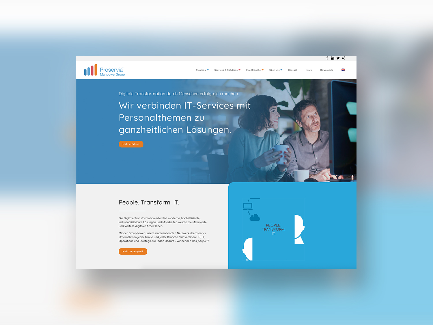
An example of the targeted use of GIFs on the web is Proservia. Here, the visitor’s gaze is dynamically directed from the very beginning.
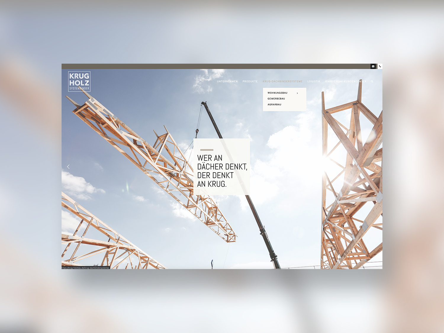
Several parallax effects are used on the website of Krug Holzbau, giving the visual world depth and dimension.
A parallax effect also enhances the depth perception of images and brings movement to the website. Here, background images or individual elements move at a different scrolling speed than the rest of the page content, which leads to a perception of depth. Existing images of a website can thus be easily provided with the parallax effect to create a modern user experience.
Emotional design elements
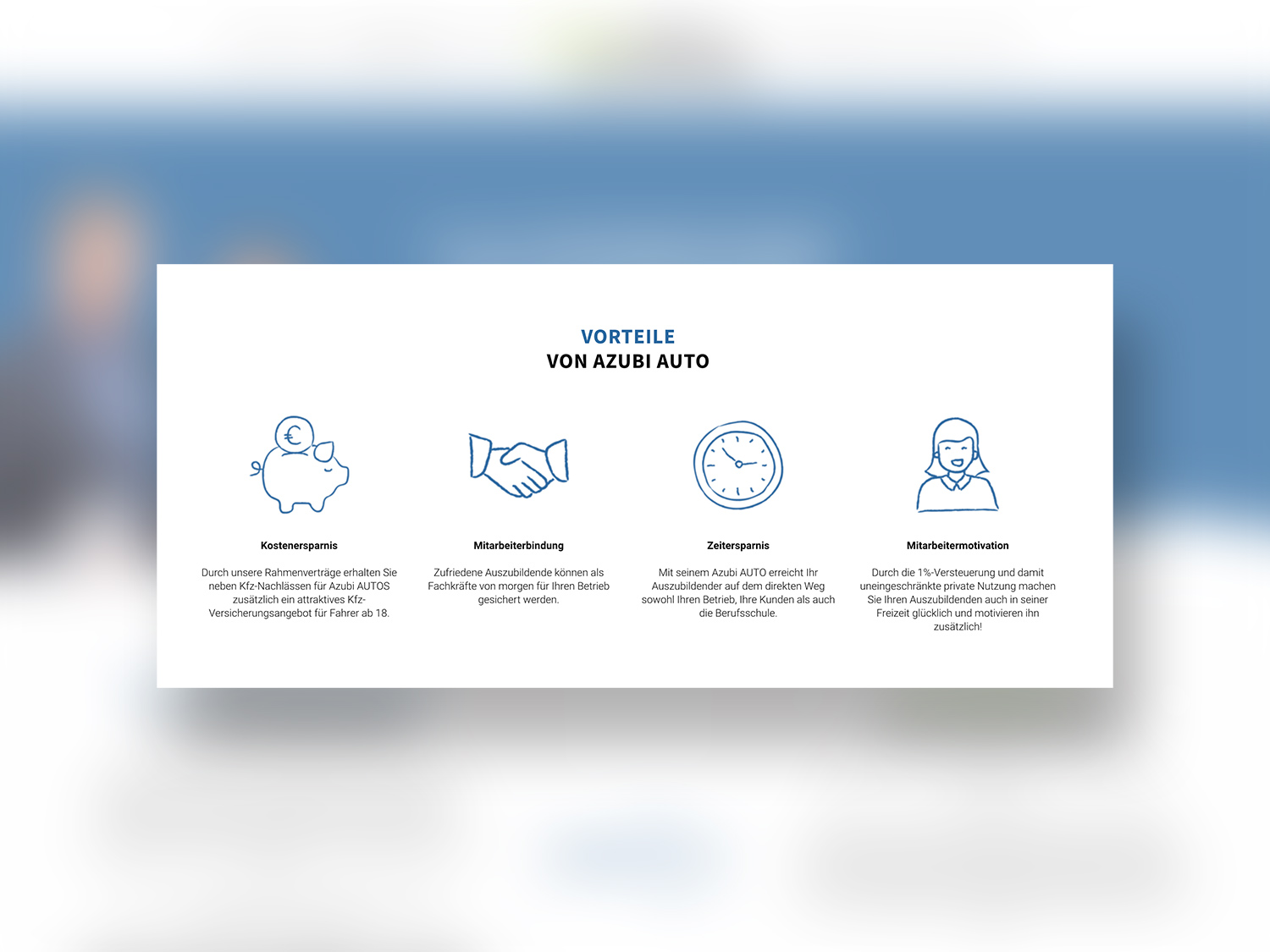
Due to the abundance of impersonal graphics and perfectionism on the web, users are increasingly longing for emotion and humanity in websites. An easy way to establish more personality and realism on the mostly factual websites is to insert hand-drawn icons and graphics. Stylized and unique elements have a positive effect on the viewer and clearly highlight the brand personality, because they put the lifelike and human aspect in the foreground. The targeted use of handmade illustrations is an antipole to the trend of perfectionist and flat design and will be seen more and more in the coming year 2020. Drawn icons are modern elements which, with just a few simple steps, ensure a web presence at the pulse of time.
“A big trend next year will be hand-drawn icons. They’re more emotional, but on a positive note. This trend is connected to the fact that we need more positive stuff around, something that can brighten up the day.”
– Elisabetta Calabritto
For medium-sized companies that want to make their web presence more modern, these tricks show a first insight into how design can keep its finger on the pulse with simple means. It is important to choose the right element for the brand and to use it in a targeted way to create an optimal experience for the potential customer.


